A Picture is Worth A Thousand Words

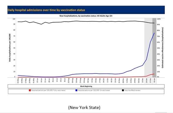
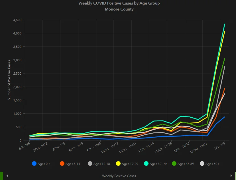
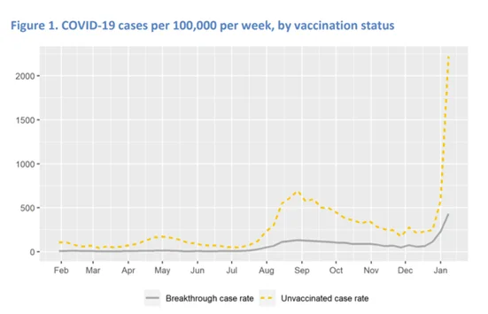
I am a “visual” learner. I like to see a picture to help reinforce information. Today, I came across 3 graphics that really drive home several points.

  • We are still very much in a pandemic with cases rising in Monroe County.

A line graph shows weekly COVID positive cases by age group in Monroe County. All age groups rise sharply after mid-December, with ages 18-29 and 30-44 peaking highest. The x-axis is dates; the y-axis is number of cases.
Cases by Age Group in Monroe County
  • Even with “breakthrough” cases, you are much more likely to get the infection if you are not immunized.
Line graph showing COVID-19 case rates per 100,000 per week from February to January. Unvaccinated rates (yellow dashed line) are consistently higher than breakthrough case rates (gray line), with a sharp rise in January.
Cases in US by Vaccination Status

The COVID-19 vaccine is very effective at preventing hospitalization.

Line graph showing daily hospitalizations per 100,000 for fully vaccinated (low, flat red line) and unvaccinated adults (rising blue line) in New York State, with vaccine effectiveness (black line) mostly above 90%.
Hospitalization Rate in NY by Vaccination Status

Recent Posts

3PEAT